Brief
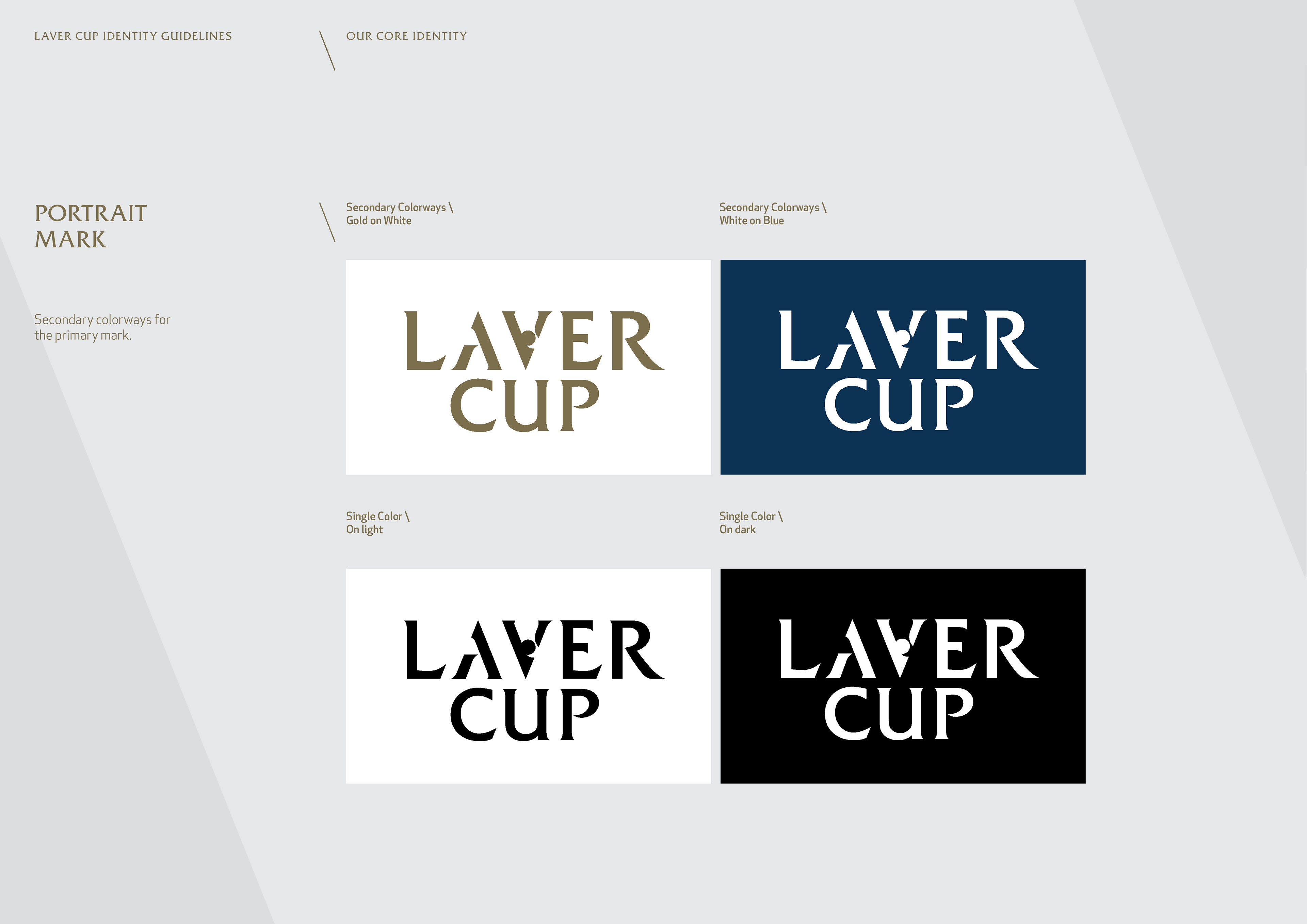
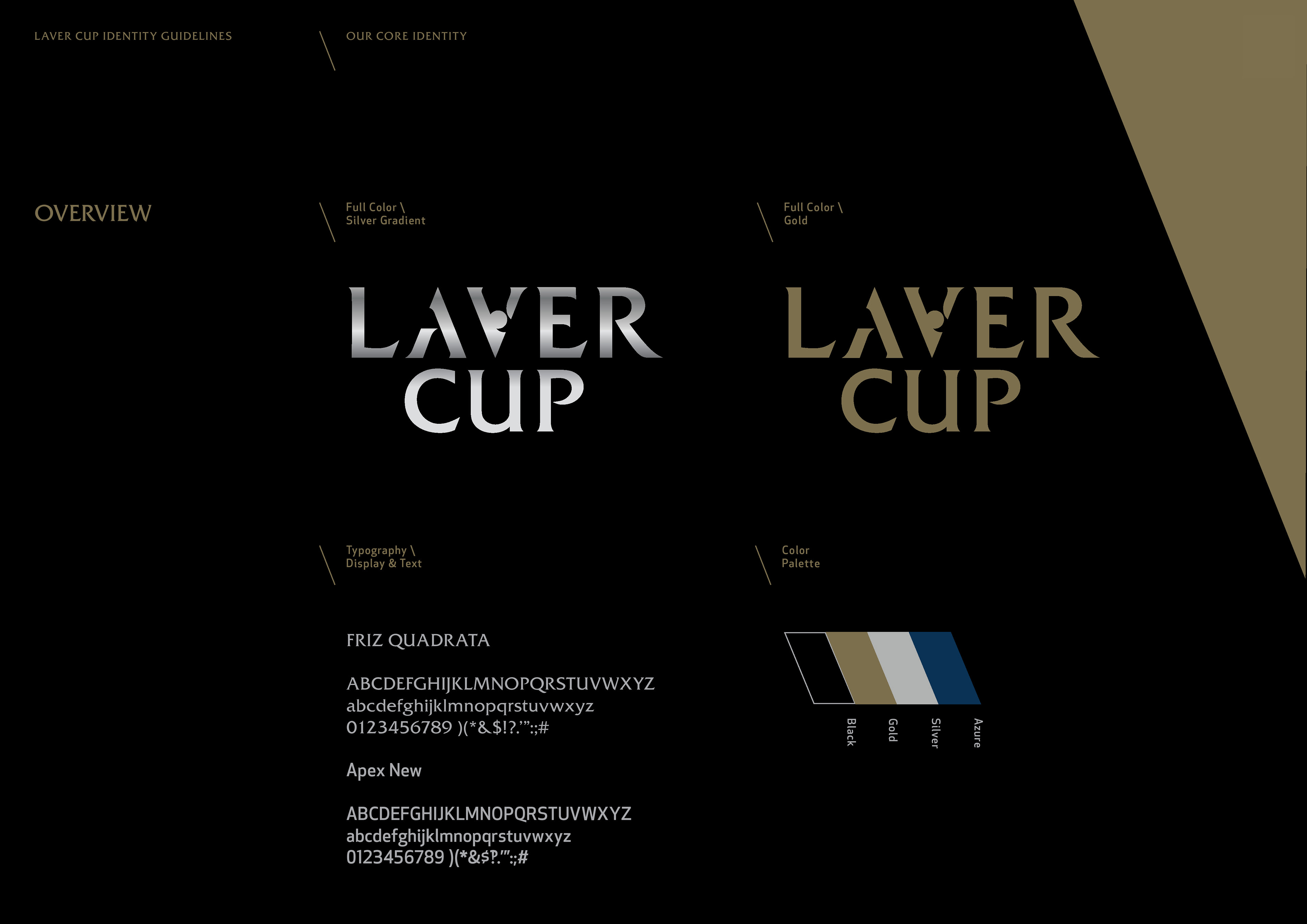
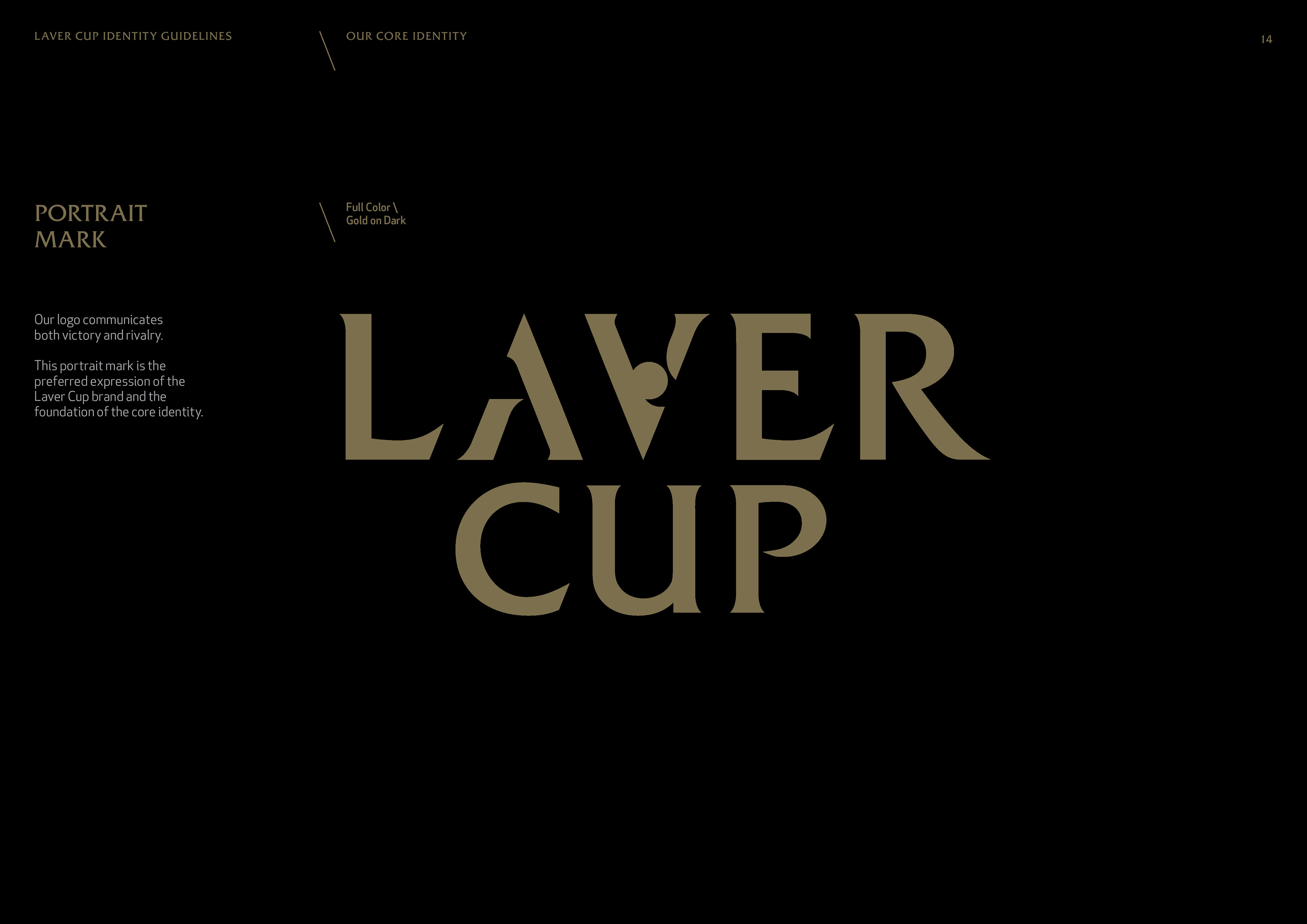
Produced over a 16 month period through an extensive research and development programme the aim was to produce a logo and brand identity that represents the history, quality and class of Rod Laver. Designed whilst working for Designwerk.
Produced over a 16 month period through an extensive research and development programme the aim was to produce a logo and brand identity that represents the history, quality and class of Rod Laver. Designed whilst working for Designwerk.
Solution
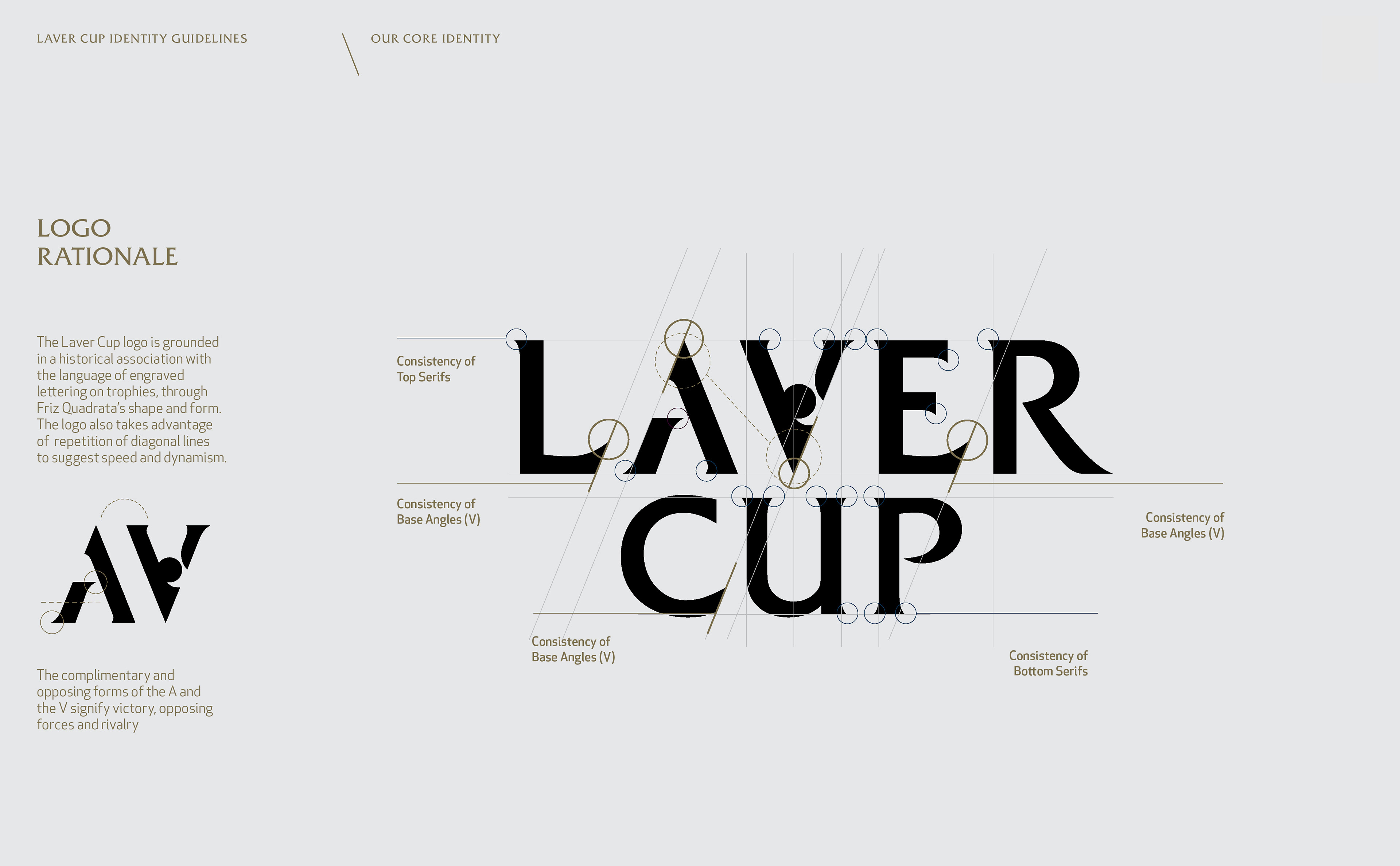
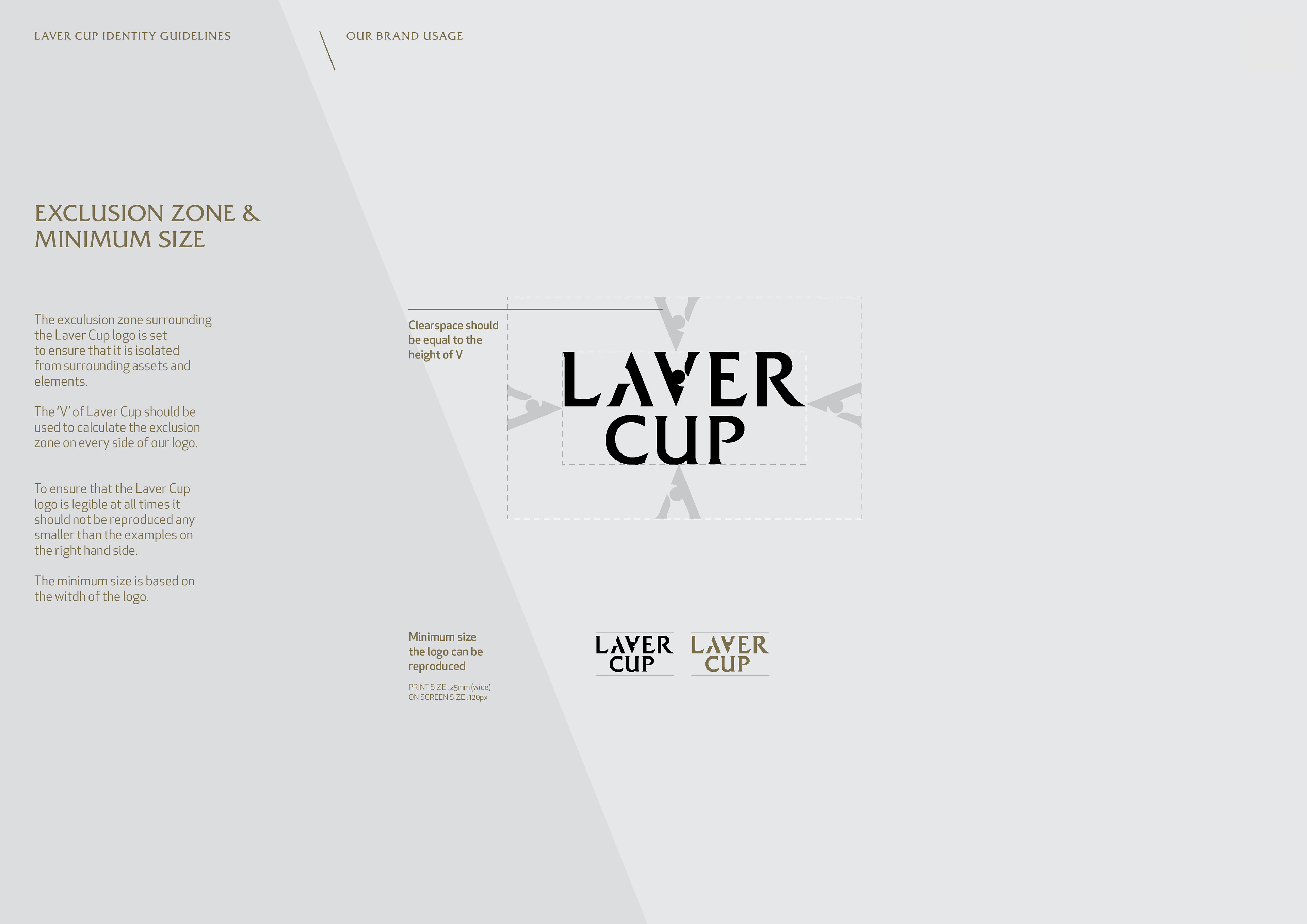
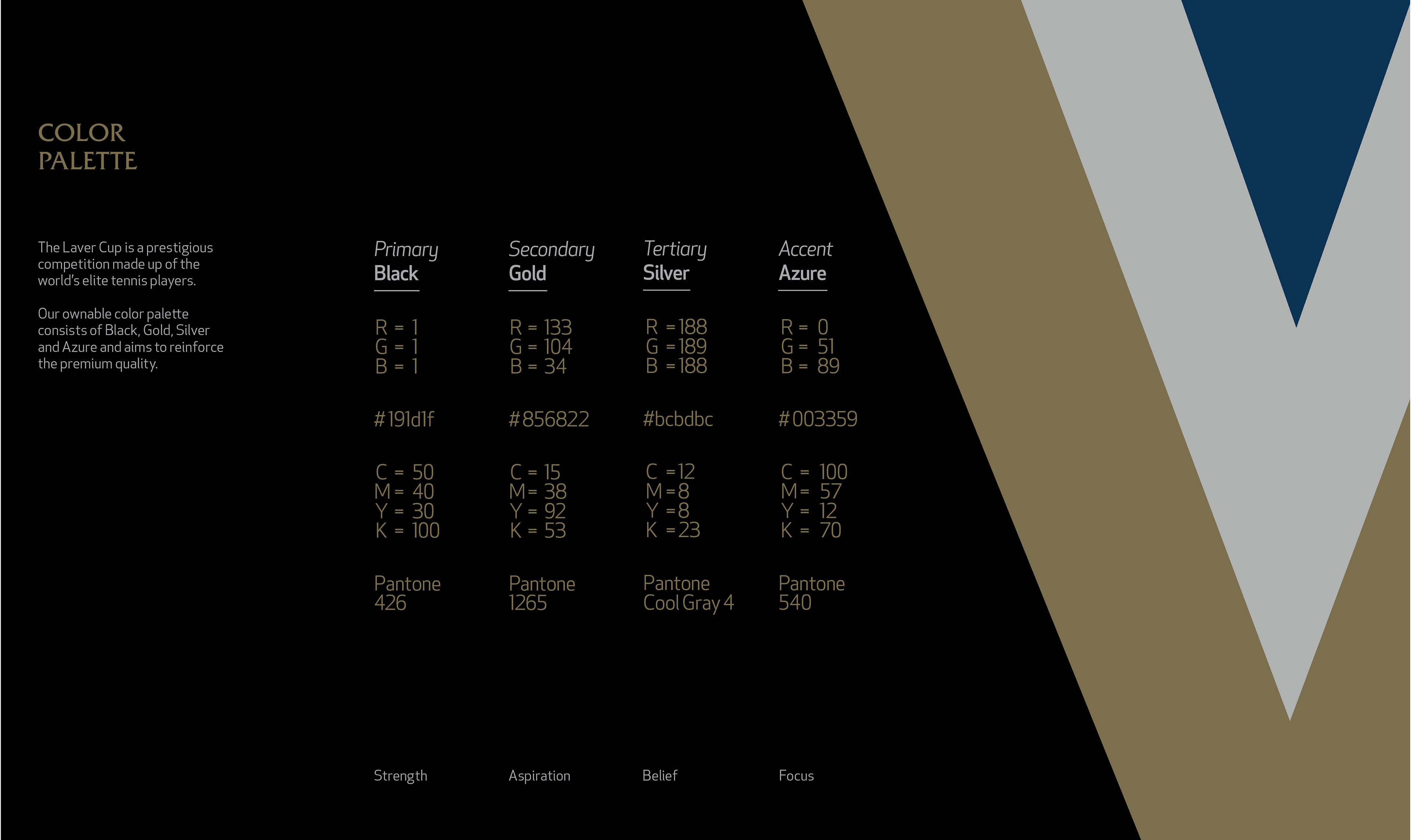
The overall brand strategy was ‘V’ for victory. This was then developed through the graphic language and brand guidelines. Europe vs The World. An annual team competition unlike any other in Men's Tennis.
The overall brand strategy was ‘V’ for victory. This was then developed through the graphic language and brand guidelines. Europe vs The World. An annual team competition unlike any other in Men's Tennis.
Application & Deliverables
Strategy. Identity, Brand architecture, Brand guidelines, TV commercial, Key Visuals, Event branding, Player spaces, Court design, Court furniture, Merchandise, Wayfinding.
Strategy. Identity, Brand architecture, Brand guidelines, TV commercial, Key Visuals, Event branding, Player spaces, Court design, Court furniture, Merchandise, Wayfinding.
Credit to Designwerk
I was hired as the Senior Designer that produced in collaboration with the design team at Designwerk.
I was hired as the Senior Designer that produced in collaboration with the design team at Designwerk.
